Featured Work
Hunter Ave Barber Shop
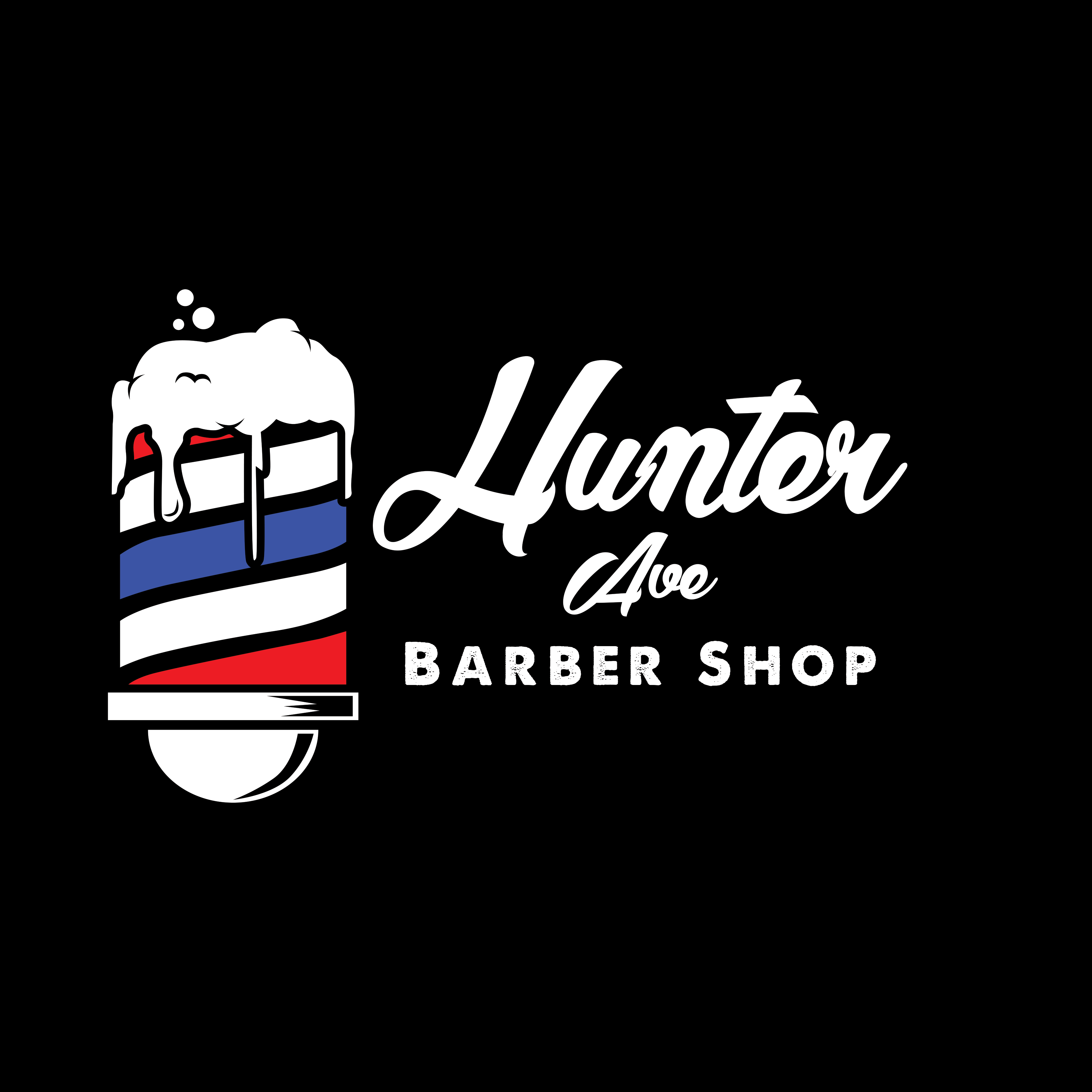
A logo that makes the shop’s distinctive promise clear at a glance: sharp cuts and a cold beer.
The challenge
The name stayed. The meaning had to get clearer.
Hunter Ave wanted a logo that felt true to the shop. The team was not interested in changing an established name, but the identity still needed to explain what made the experience different.
The mark had to read unmistakably as a barber shop while making room for an important part of the visit: customers can enjoy a beer while they get cleaned up.
The idea
Let the logo do the explaining.
Instead of forcing the beer story into the name, the identity carries it visually. A classic barber pole becomes a beer glass, complete with foam. Red, white, and blue keep the familiar barber-shop cues, while the beer reference makes the shop’s hospitality part of the identity instead of an afterthought.
The result
A familiar symbol with a second meaning.
The finished identity gives Hunter Ave an immediate double read: barber shop first, beer close behind. It keeps the name intact, represents the personality of the business, and turns a distinctive part of the customer experience into the thing people remember.